2023 Homepage Rebuild
TLDR: I redesigned and rebuilt my blog with zaduma, Astro, Solid.js, Tailwind, MDX, Shiki Twoslash, Vercel OG on Edge Functions, Astro Image, Plaiceholder
Motivation
I’ve survived a couple of years without redesigning my website, a nice score for a person building user interfaces daily. Until now. Surprisingly, I’m not motivated by the framework churn and the hype for Astro, nor frustration with the tech debt decay and dependency drift of my previous homepage codebase.
Neither am I pursuing better performance metrics. Going from a static website built with Gatsby to a static website built with Astro gets me less JavaScript shipped, shorter build times, and frees me from using GraphQL to read a markdown file, but it’s not a huge change from the visitor’s perspective.
I had fun building my previous homepage. It was over-engineered, and it had everything: fp-ts, backlinks, a Roam-inspired force graph of notes, custom Gatsby plugins, you name it.
On my old website I handwrote and animated
an actual SVG sandwich for the menu icon. And then I overengineered it to work
without JavaScript with #menu-id:target ~ & trick.
Fun is over. I’m a boring person now, and I want simplicity.
I’m trying to do something more basic, more classic. I’m choosing simpler tech and almost minimal design.
Design
To get to that boring and classic, I chose a grayscale color scheme and centered layout. I’ve spent some time thinking about typography. I’m not completely satisfied, but I settled on the standard Inter and a personal touch of Brygada 1918.
I’m slowly starting to consider removing Brygada and going with just one font, but I do find the current state of things quite passable, and I can’t keep fiddling with it ad infinitum.
Centered layout is practical. It allows me to use the left side for a table of
contents, and the right side for asides with comments and tangentially related
notes.
Tech Stack
Zaduma
I’ve built an Astro starter, called Zaduma to work on all the features I want in isolation, and not when I’m writing a blogpost.
Aleksandra had a Gatsby site too, so now we’re collaborating on the starter. We’d like Zaduma to be a minimalistic starter for technical weblogs and documentation pages. We’ve added some personal touches like a grain overlay and Shiki Twoslash, assuming that TypeScript is already a most popular programming language.
Astro
We went with Astro, firstly because it just fits, and SSG is fair choice for a blog. Secondly, because I started before Next 13 was announced, and Astro was first on my list of new things to learn. We want to ship less JavaScript, and get nice perf out of the box.
Solid.js
For the components framework, we’re taking Solid, because it’s absurdly good,
especially coming from React. It still doesn’t have enough of an ecosystem, and
until very recently it lacked equivalents of accessible foundations style
libraries like Radix UI, but I won’t need much here. I’m fine with writing my
own command pallette instead of downloading cmdk.
Tailwind CSS
Tailwind gets us a nice set of design tokens, and it’s popular enough we can use it in a public starter. Combined with the VSCode Extension, it becomes arguably the best CSS-in-JS library, with an added benefit of not being a CSS-in-JS library, so you can use it in your old Rails projects and on your mom’s Wordpress website.
If you’re not a person who builds design systems and frontend tooling daily, and you don’t have time to check out every CSS solution, stick with Tailwind. Atomic CSS gets us the best performance and a surprisingly small number of footguns. It’s just good.
Vercel OG takes care of social card pictures. It was a bit of an investment to set it up on Vercel Edge Functions with Astro, but I feel it will pay off.
Performance
Metrics
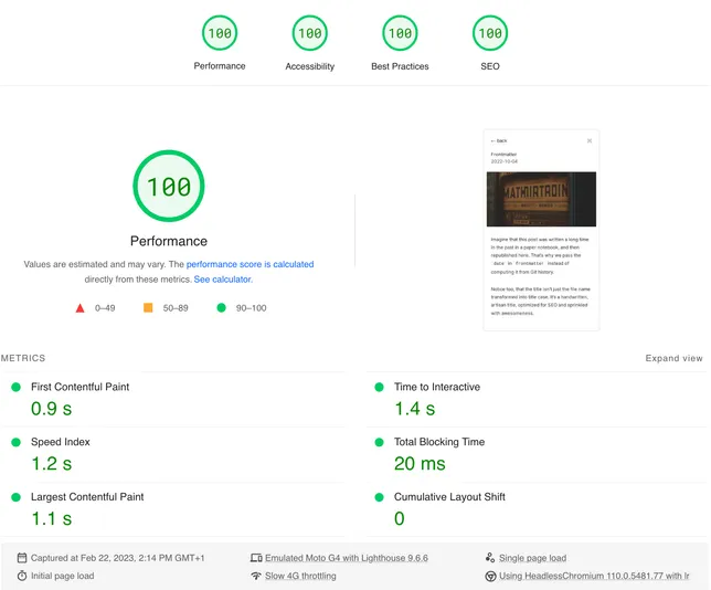
There are some perf improvements that could have been done on my old site, but it was still all green.
| Mobile with Gatsby | Desktop with Gatsby |
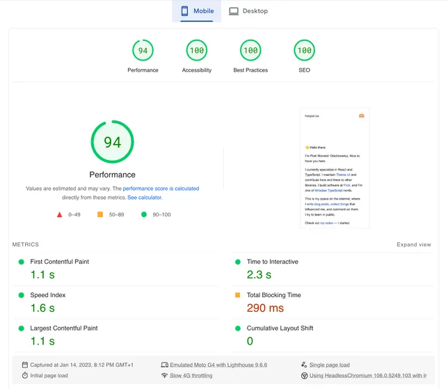 | 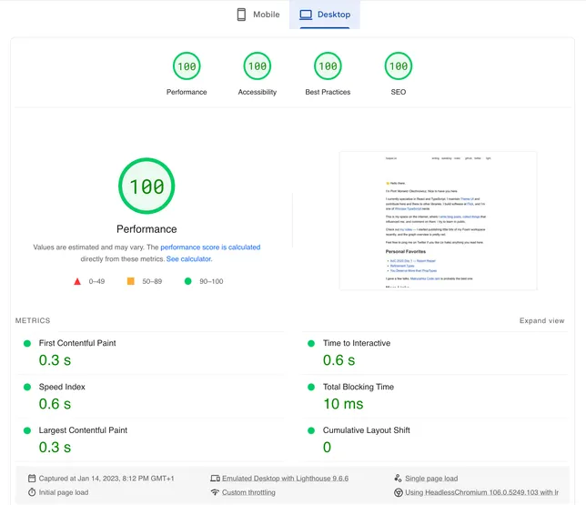 |
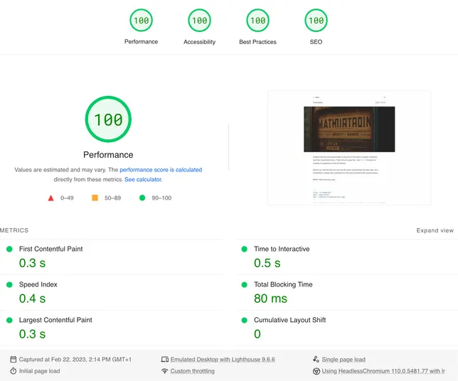
With Astro, Astro Image and Plaiceholder, we top that. Turns out a black-and-white website with little to no content is pretty fast. May not be much to celebrate, but getting a FCP under one second, and 4x100 scores on web.dev/measure makes me smile a bit.
| Mobile with Astro | Desktop with Astro |
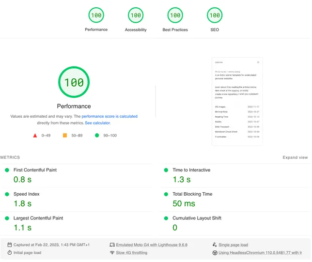 | 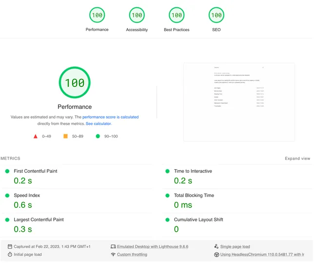 |
 |  |
Preloading fonts
Preloading Inter helps me get away with font-display: block. I realize it’s
silly, and I should use swap, but my eyes strongly prefer invisible text over
Flash Of Unstyled Text.
---
import interPath from "@fontsource/inter/files/inter-latin-variable-wghtOnly-normal.woff2";
---

<link rel="preload" href={interPath} as="font" type="font/woff2" crossorigin />
Caveats
Zaduma was my first Astro project, and unsurprisingly, I had to confront my
application developer habits with MPAs. Displaying a shared UI element which
state depends on localStorage (like a color scheme toggle) is a hard problem.
I wrote about it
in zaduma repo.
Even Astro docs have this issue,
so I ended up pivoting to a command palette.
If you end up generating your website with Zaduma, please let me know what you think and if you encountered any bugs. Thank you for your attention 🙏